Typography in the Age of Infinite Scrolling
When billions of videos compete for an average user attention span of just three seconds, standard closed captions are simply not enough to cut through the noise. The explosion of short-form vertical video has forced sophisticated creators to think about their subtitle typography as deeply as they think about their camera lenses, lighting, and audio equipment.
The text on your screen acts as a secondary visual hook. If it looks cheap, boring, or difficult to read, your viewer will swipe away. If it looks polished, dynamic, and native to the platform, it can single-handedly save a video with mediocre pacing.
Here is a comprehensive breakdown of the top-performing caption aesthetics in the industry right now, and exactly when you should employ them in your content strategy.
1. The "Hormozi" Style (Aggressive & High Energy)
Named after the incredibly popular entrepreneur and content creator Alex Hormozi (whose team arguably popularized the modern short-form editing style), this aesthetic is aggressive, bright, and impossible to ignore.
Visual Characteristics: It features bold, ultra-thick chunky fonts (like The Bold Font or Montserrat Black) heavily stylized with thick black outlines, dark drop shadows, and frequent emojis. The hallmark of this style is dynamic word-by-word highlighting, where the current spoken word pops up in a vibrant yellow or green color.
When to use it: It's perfectly suited for fast-paced, high-information-density videos. Think business advice, intense fitness tips, financial planning, and motivational speeches. The absolute goal with this style is almost algorithmic manipulation—the text flashes quickly enough that the user physically cannot read fast enough while scrolling, forcing their brain to pause the scroll to re-read what was just said.
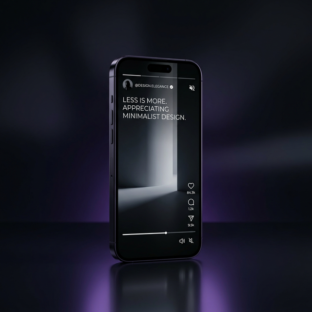
2. The Minimalist Documentarian (Sleek & Cinematic)
A stark contrast to the aggressive aesthetic, this style takes its inspiration directly from modern documentaries, Netflix specials, and high-end streaming giants.
Visual Characteristics: The font is usually a very clean, thin, modern sans-serif. Think fonts like Helvetica Neue, Inter, or Roboto Light. Instead of jumping around or changing color constantly, the text stays fixed at the bottom center of the screen in clean, crisp white (sometimes with an incredibly subtle, feathered black drop shadow just to separate it from bright backgrounds). It provides context without screaming for attention.
When to use it: This style works best when your raw visuals are stunning and need to breathe. If you are a travel vlogger showcasing a drone shot of the Swiss Alps, a real estate agent touring a $10M mansion, or showcasing high-end product cinematography, you want people to observe the video. A massive yellow bouncing font will ruin the cinematic aesthetic.
3. The Karaoke or "Bouncing Ball" (Playful & Educational)
This style strikes a perfect balance between high-energy and clean typography. It highlights the current spoken word by smoothly changing its color from left to right, or subtly enlarging the active word, similar to a bouncing ball on a vintage karaoke screen.
Visual Characteristics: Medium-weight fonts. Standard white for unread text, turning blue or red as the words are spoken out loud. The animation is smooth and connected, rather than harsh and popping.
When to use it: This helps viewers track the speaker's exact cadence perfectly. It significantly aids comprehension in tutorials, coding walkthroughs, explainer animations, or 'How-To' cooking videos. The aesthetic lies somewhere between aggressive and minimal—helpful, visually pleasing, but not overly distracting.
4. The Typewriter (Nostalgic & Storytelling)
The typewriter effect reveals letters one by one, simulating someone physically typing out the transcript.
Visual Characteristics: Often paired with monospaced fonts (like Courier New or Roboto Mono) to sell the aesthetic. It can be paired with a subtle clicking sound effect, though this should be used sparingly.
When to use it: This format is exceptional for storytelling, reciting poetry, true crime narratives, or 'POV' style videos where internal monologue is being displayed. It creates suspense because the viewer has to literally wait for the sentence to finish printing.
Choosing Your Look and Iterating
You do not need to be married to one style forever. With AI video tools like ReelWords, you can switch between these varied aesthetics with a single click of a button rather than spending hours rebuilding text layers in Adobe Premiere.
Experimenting with your caption styles and tracking the direct impact on your audience retention graphs is a critical component of video marketing. If your business advice videos are underperforming, try switching from the Minimalist style to the Hormozi style. The data will eventually reveal exactly what resonates best with your specific audience.